"The artist...is also a born adventurer. His explorations, unlike those of a tourist, are rewarded by the discovery of beauty spots unmentioned in the guide books, and with tireless curiosity and an exceptional proneness to wonderment, he will come upon objects of remarkable interest overlooked or even shunned by more disciplined observers."

Augustus John, R.A.


Sunday, 21 April 2013

Roosting Cormorant Print Finished


With the addition of a  purple/brown and then a slightly darker tone of the same colour onto the birds and foreground branches, the composition becomes clearer.


another dark starts to pull it all together. Just one more to go:


Roosting Cormorants
190mm x 169mm

This print was made using just white, yellow ochre and cadmium red (mixed to make the orange) and purple made from a mix of cadmium red and ultramarine blue.

Sunday, 14 April 2013

Sunset Print

The next three colours work on building up the sky. All use the same initial orange mix gradually darkened with increasing amounts of purple.


Once the sky is finished I print a pale grey over the remaining block. With apologies for the shine from the still wet ink. 


The pale grey is followed by a darker version of the same colour. By now the subject should be apparent.


I think another three colours should see the print finished.

Sunday, 7 April 2013

Rainy day on the Dutch River


Rainy day on the Dutch River.
12 colour reduction linocut. 252mm x 364mm
Edition of 7.

As mentioned in the previous post I finally got this print finished last weekend. I started out with 10 prints but lost three in the process. Although registration was a little bit more difficult than usual it wasn't the cause of the rejected prints. I have been using some quite thin (probably too thin), Hosho paper for this print and all three were lost when they stuck to the block and tore as I pulled them away.

Having finished this print I started on the next straight away....


First colour a pale yellow over the entire block.


Next a pale orange.


Sunday, 31 March 2013

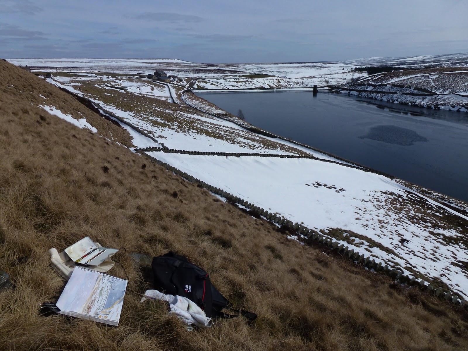
Out in the cold

After spending the morning finishing the Rainy day print and printing the first two colours on a new linocut. This afternoon found me in the snow high on the moors above Holmfirth.


It was bitterly cold in the biting wind and the watercolour took a long time to dry, although at least it didn't freeze on the brush. Spent about half an hour on the sketch and that was about as much as my fingers could stand. It was a nice afternoon though, with grouse and curlew calling from across the moor, and even a wood mouse scurrying around.

Sunday, 24 March 2013

After another couple of days cutting and printing the rainy day print is almost finished.


I've printed a warm orange down the left side of the print to put some colour into the dead reeds on the river bank.


Then a darker version of the first green.


This next colour, a pale blue green for the distant woodland should really have been printed a couple of colours ago but I had forgotten about it. Fortunately none of the block in this area had been removed.


A darker version adds some definition into the distant trees.


And another dark green defines the right hand river bank. Should be finished now after one more colour.

Sunday, 17 March 2013

Rainy Day

Looking back through my previous prints it became apparent that I could be giving a false impression of my home county. Whilst its true that we do sometimes get warm sunny days and blue skies, dotted with cotton wool clouds arranged in a convenient composition. Climatically Yorkshire does have more in common with Wales and the Lake District than with the South of France. More often than not we have grey skies and rain. So in order to re-dress the balance here goes....


First colour, an overall warm greyish tone with some white streaks which hopefully will suggest rain.


Colour 2.
Next colour is simply a darker tone of colour 1. Trying to suggest the break in the clouds.


Colour 3.
A slightly darker blue grey tone finishes off the sky and the river in the foreground, now to add some colour into the landscape.


Colour 4.
The first green. Although not a lot of this will show in the finished print. I'm trying to keep the tonal changes quite subtle as I need to give the impression of the flat light of a rainy day.


Colour 5.
A  pale brown for the muddy river bank and the reedbed on the left side.


Colour 6
A darker tone of colour 5 to add some texture to the mud and more definition to the reeds. The cutting and printing to get to this stage has taken 4 days so far. Another three but more likely four colours to go.

Sunday, 3 March 2013

Sprotborough Flash

Since the last posting on this print I have finally got it finished although without having photographed any of the intermediate step by step stages.


Summer-Sprotborough Flash
14 Colour Reduction Linocut. 254mm x 364mm. Edition of 5