"The artist...is also a born adventurer. His explorations, unlike those of a tourist, are rewarded by the discovery of beauty spots unmentioned in the guide books, and with tireless curiosity and an exceptional proneness to wonderment, he will come upon objects of remarkable interest overlooked or even shunned by more disciplined observers."

Augustus John, R.A.


Showing posts with label work in progress. Show all posts

Sunday, 11 February 2018

Castlerigg - 2

Got up early this morning and printed two impressions from the plate to get an idea of how much more work is needed.


The plate, inked, wiped and positioned on the bed of the press.


1st Impression


2nd Impression

Overall pretty much what I was expecting, still quite a lot of the plate needs to be lightened. The whole sky area needs brightening up especially the clouds above the top of the fell. The wisps of mist sweeping off the summit need to be blended back into the clouds. Although I want to keep the area in the top left quite dark to act as a foil to balance the dark line of spruce trees in the lower right. The two foreground rocks need more work to bring out the texture in the stone and I haven't yet decided what to do with the dark shadow areas running across the foreground.

Saturday, 18 February 2017

Ready to Edition

After a couple more weeks working on the mezzotint plate it is now at a stage where it is ready to edition.


Sunday, 29 January 2017

Blea Gill - Mezzotint

I started a new mezzotint just before Christmas, beginning work on putting the image on to the plate the first week in December. By mid January the plate was at a stage where I needed to take an impression just to give me an idea of how it would look like printed. On the plate the image looks quite well defined, however this is very misleading as can be seen on the 1st state impression, which is still very dark and on paper not as well defined as the plate image would suggest.


Plate at state i

Image at state i
The image is very dark and with little definition. The sky is starting to take shape and while the waterfall is clear it needs more burnishing to bring out the highlights on the water.


Image at state ii

Image at state iii
More work on the sky, a combination of scraping and burnishing back the burrs is starting to define the clouds and veils of mist sweeping down the valley towards the waterfall.

Image at state iv
Slowly pulling out and sharpening up the image. At this stage the image is almost ready to edition. The cliff to the left of the waterfall needs to be lightened up, it is supposed to be sunlit! The clouds need to be lightened in parts to break up the uniform grey tone.

Wednesday, 22 June 2016

Curlew print - next colours


Next couple of colours on the curlew print, a mid  brown and darker blue grey. A final dark brow will see it finished.

Sunday, 19 June 2016

Curlew - First stages

Started on a new lino print, originally intending it to be of two curlews but after some preliminary juggling around decided to leave the second bird out.


After cutting out the white areas, the first colour above, is a blend of 3 pale greys working from top to bottom.


Next much of the cloud surrounding the bird is cut away and the block inked with a pale yellow brown.


Colour 3 is a pale blue. I thought a lot about how to do this. Initially I was going to do it as a blue to pale blue grey blend as I needed the lower part of the print to look as if it was receding into the distance. In the end I decided on using a flat blue colour, relying on the greys of the cloud in the lower half to shift the appearance of the blue there making it look less bright than in the top half where it sits alongside the white of the paper.


Colour 4. With the sky finished all that remains on the block is the shape of the bird, this is inked in a darker version of the first brown colour.


Colour 5. A darker blue completes the shadows under the birds wing. Should be finished after another couple of colours. Hopefully in time for the Art Market at Holmfirth next weekend. If not it will be finished for the Sheffield Print Fair in July.

Thursday, 25 February 2016

Another Owl

Continuing with the theme from the previous print - here we have another Owl. Different species this time though.


Colour 1 - a warm yellow ochre


Colour 2 - a darker tone of colour 1


Colour 3 - a cool grey, sorry about the quality of the photo. I hadn't realised it was this bad until after I printed the next colour and then it was too late to retake it.


Colour 4 - Light blue


Colour 5 - light green with some grey mixed in.


Colour 6 - Moving back to warmer tones with a light brown.


Colour 7 - the brown above with some purple grey added.


Colour 8 - darker tone of the previous colour.


Colour 9 - Another dark purple brown to add some texture into the rocks. One more final dark to go.

Sunday, 24 January 2016

Next steps on the new print.

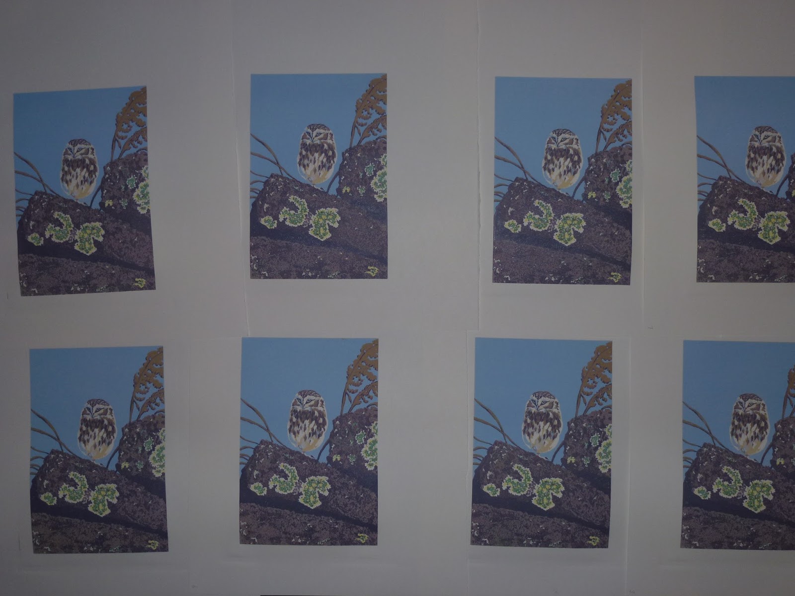
After a weeks work there are big changes in the way the print is looking. To start off I decided to work on the Owl before continuing with the landscape.


The 4th stage colour is a yellow ochre.


Rolled on the block I then carefully wiped away any ink from the area around the Owl.


Printed it starts to give definition to the bird.


The 5th stage is darker tone of the same colour.


Again I carefully wiped any stray ink from the block before printing.


and the Owl starts to appear from the background.


 The 6th stage is a blue grey colour to bring out the plumage details.


Rolled on the block and it can be seen that not much material remains on the Owl.


and printed.


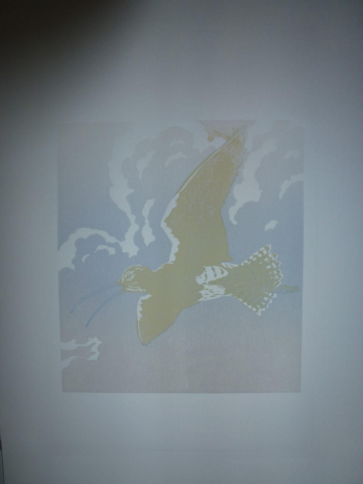
With the owl more or less finished apart from dropping in a final dark for its eye. It's time to turn back to the landscape. The 7th stage is another blend.


The ink rolled out gives an indication of how the block has been cut.


The difficulty now is to maintain the atmosphere of the print.


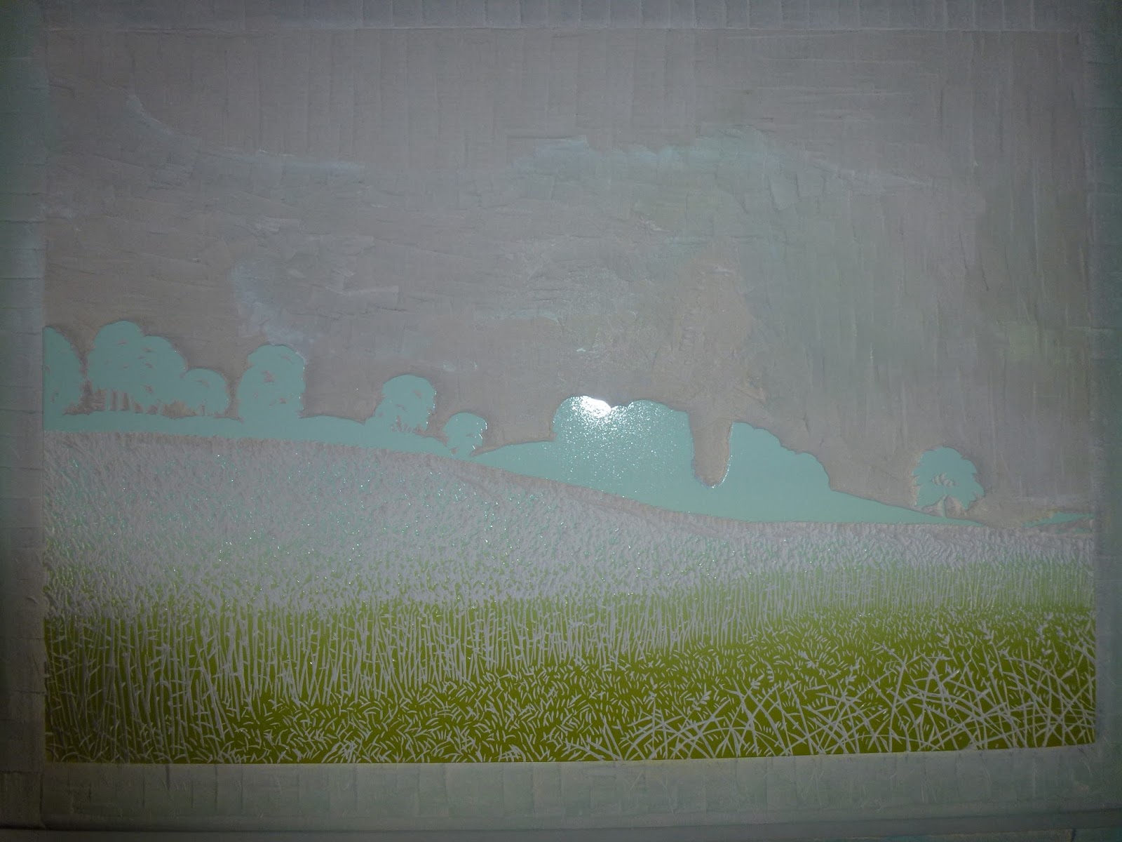
After more cutting Stage 8 is a two colour blend.


On the block a big area in the centre has been removed.


and printed. The next colour changes need to be quite subtle to maintain the dusky atmosphere.


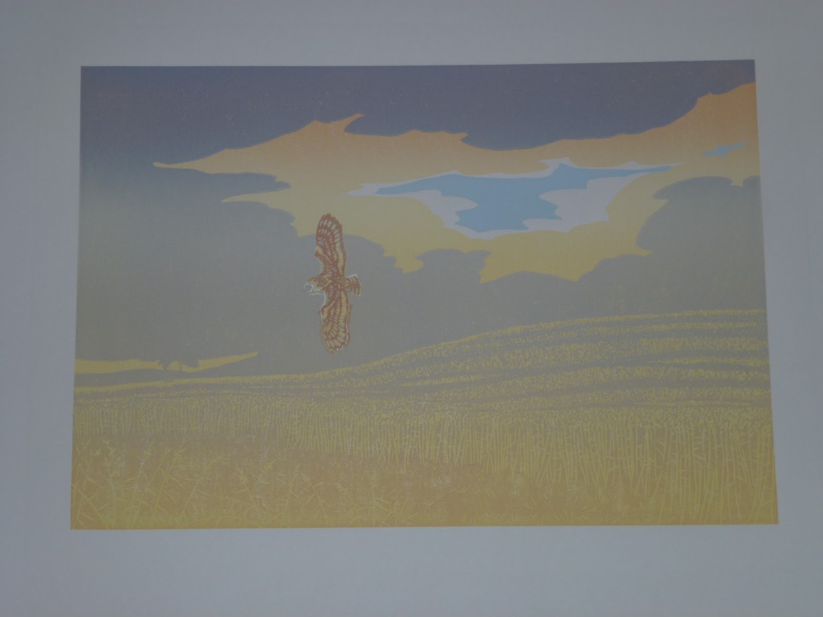
Stage 9. Two colours, a darker blue grey and a dark brown for the wheatfield. The small blob of ink floating around on its own to the right of where the Owl was will drop the dark colour on to its eye.


Printed and we are nearing the end. Only a couple more stages to go.


Stage 10. Two more colours, another dark grey and a dark green.


Not much lino left now.


After printing only a final dark colour to go now.

Sunday, 17 January 2016

First steps on a new print

The start of a new and quite complicated print. The sequence shows the results of the first few days work.


The block cut and ready to be inked with the first colour,


which will be a blend of four shades of yellow.


Rolled out


and the block inked, which gives an indication of how little has been cut from it at this stage.


The first colours printed.


Next is a pale blue


but only in a small and discrete part of the block so all I've cut so far is the area immediately around the patch of blue. There will be a lot of cutting to do after this has been printed before the next big block of colour can go down.


The blue printed.


After the next colour, another blend, this time three greys and a darker yellow ochre.


The inked block shows how much material has been removed since printing the blue. Hopefully this blend of cool greys over the yellow and orange will set the atmosphere for the print.


And printed. So far we have nine colours printed in 3 stages. The sky is now finished so the next step is to remove all of the material above the horizon line before deciding what to do next. The Owl is positioned such that once this has been done, I can work on it without having to ink any other part of the block. It needs to have a couple more colours to define it's plumage properly; a darker yellow ochre and a dark blue grey. So I may do this next before continuing to work the landscape.