"The artist...is also a born adventurer. His explorations, unlike those of a tourist, are rewarded by the discovery of beauty spots unmentioned in the guide books, and with tireless curiosity and an exceptional proneness to wonderment, he will come upon objects of remarkable interest overlooked or even shunned by more disciplined observers."

Augustus John, R.A.


Saturday, 19 March 2016

Fishy Prints

Following on from a recent small print I made of a Brown Trout rising to take a fly. Which, when I posted it on the excellent Linocut Friends facebook page, created quite a lot of interest in how it had been made. I promised to do another and show all the step by step stages. So here it is:

This is my working drawing with all the elements drawn out and the pattern of ripples determined. Like any representational image the basic problem is to give the illusion of depth. Although unlike a landscape, where you only really have to be concerned with the depth from the foreground to the horizon. With this print I want to give the illusion of not only the water surface going away from the viewer, but also the depth of water below the surface and then getting deeper as the river bed drops away beyond the fish.


Step 1.


There is only one spot of pure white in this print, where the fish just breaks the surface of the water. So a small piece of lino is cut out and the block inked up in a pale yellow colour and printed as below.


Step 2.


Some more small marks are made in the lino to represent small paler pebbles on the river bed. At this stage because the initial colours are pale and I don't want to risk the drawing offsetting on to the print. I am only drawing on to the block the areas that I am removing. Once all the marks that I want have been cut away I ink up in a pale blue.


and print as below.


Step 3.

The pale blue represents the paler ripples moving across the water surface. So these are now cut away from the block and the shape of the fish drawn on.


I mix up three colours, a pale yellowish grey, an orange and a pale purplish grey and using a brush carefully paint the ink onto the block to give me the basic body colour of the fish.


Although this stage is essentially a monoprint, with care it is possible to get a consistent result across the edition of 10 prints.


Step 4.


With the body colour of the fish defined I cut out a lot of the paler areas from its body leaving just the darker bits on its upper surface. I mix up a blend of yellow through orange and brown to a slightly darker blue than that used previously. This is going to put down the base colour for the river bed, some details on the fish's body and finish off the water surface in one go. (The size of the image at 240mm high was determined by the size of my largest roller, as I need this blended roll to cover the whole block in one go).


From now on it's just a matter of gradually darkening the oranges and browns to complete the details in the  print.

Step 5.


After cutting out some pebble shapes a three colour blend of copper through brown to blue grey is rolled on the block and printed.


And the print starts to emerge.


Step 6.


 More cutting away of pebble shapes and spots on the fish's body and the block is inked with a dark purple grey colour. This was intended to be the final colour but looking at the print I wasn't happy with abrubt end to the pebbles. I wanted to give the impression of them fading out of view into the deeper water but this colour has made them too dark in contrast to the water colour.

Step 7.

As a fix, I mix up a blend of a dark purple grey fading to pale blue and ink up the block again.


and the final print.

Sunday, 28 February 2016

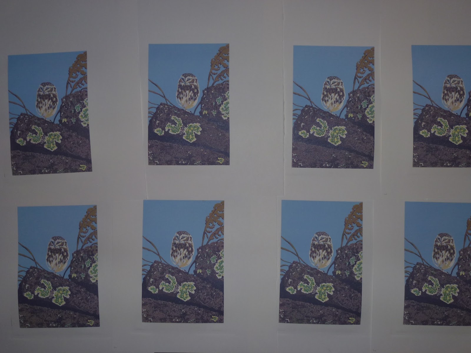
Little Owl

Finished the Little Owl print with the addition of the final dark.


Little Owl
10 colour reduction linocut
220mm x 146mm
Edition Size 9

Thursday, 25 February 2016

Another Owl

Continuing with the theme from the previous print - here we have another Owl. Different species this time though.


Colour 1 - a warm yellow ochre


Colour 2 - a darker tone of colour 1


Colour 3 - a cool grey, sorry about the quality of the photo. I hadn't realised it was this bad until after I printed the next colour and then it was too late to retake it.


Colour 4 - Light blue


Colour 5 - light green with some grey mixed in.


Colour 6 - Moving back to warmer tones with a light brown.


Colour 7 - the brown above with some purple grey added.


Colour 8 - darker tone of the previous colour.


Colour 9 - Another dark purple brown to add some texture into the rocks. One more final dark to go.

Sunday, 31 January 2016

Barn Owl Print

Finally finished the Barn Owl print with the addition of the final dark just to bring out the foreground detail.


The block inked for the final time.

and the finished print.


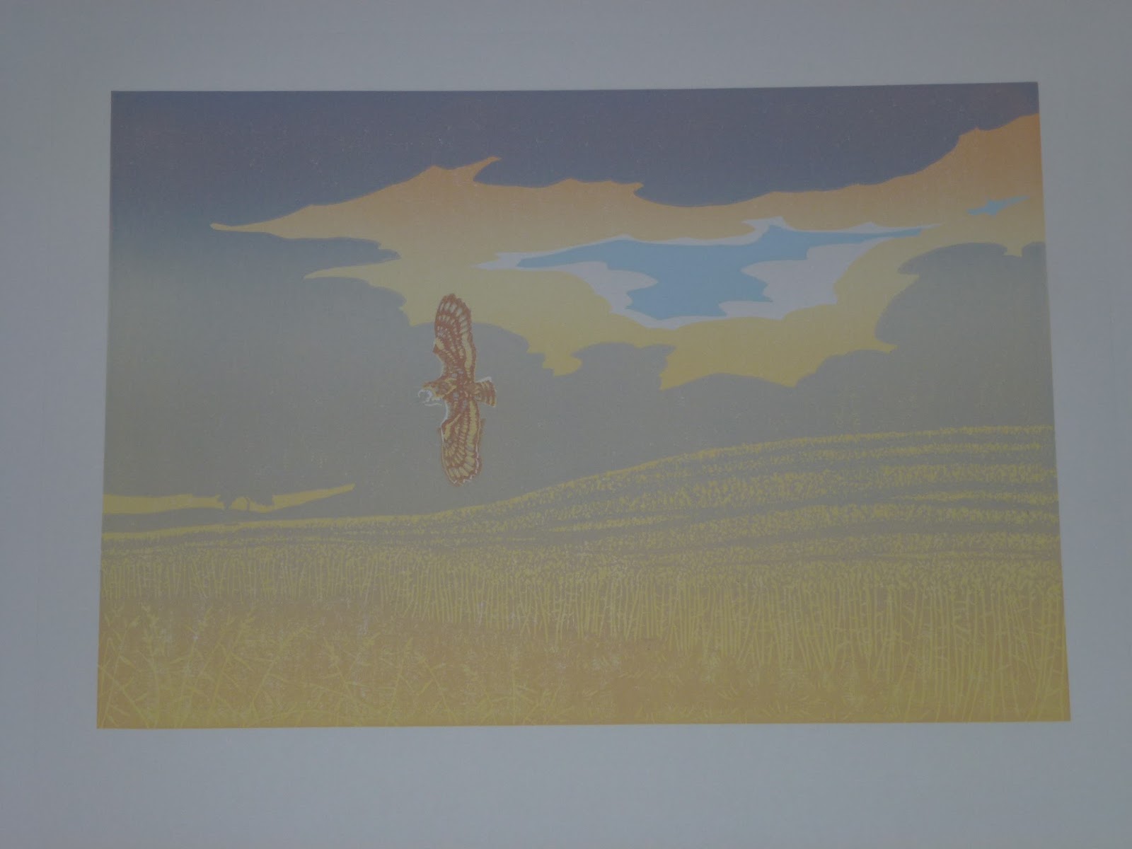
Summer Dusk
Reduction Linocut.
250mm x 362mm
Edition of 8 prints.

To recap, there are 23 colours on this print inked up and printed in 11 stages as below:

Stage 1. A blend of orange and 3 shades of yellow.
Stage 2. A light blue printed on its own for the small patch of blue sky.
Stage 3. A blend of 3 shades of grey and yellow ochre.
Stage 4. A darker yellow ochre on the Owl only.
Stage 5. A darker tone of the yellow ochre above again on the Owl only.
Stage 6. A blue grey on the Owl only.
Stage 7. A blend of blue grey, light brown and light green.
Stages 8 and 9. Progressively darker shades of the above blend.
Stage 10. A blend of blue grey and green.
Stage 11. Final darker darker blend of the Stage 10 colours.

The print can be purchased by following the link on the right to my Folksy shop or here

Sunday, 24 January 2016

Next steps on the new print.

After a weeks work there are big changes in the way the print is looking. To start off I decided to work on the Owl before continuing with the landscape.


The 4th stage colour is a yellow ochre.


Rolled on the block I then carefully wiped away any ink from the area around the Owl.


Printed it starts to give definition to the bird.


The 5th stage is darker tone of the same colour.


Again I carefully wiped any stray ink from the block before printing.


and the Owl starts to appear from the background.


 The 6th stage is a blue grey colour to bring out the plumage details.


Rolled on the block and it can be seen that not much material remains on the Owl.


and printed.


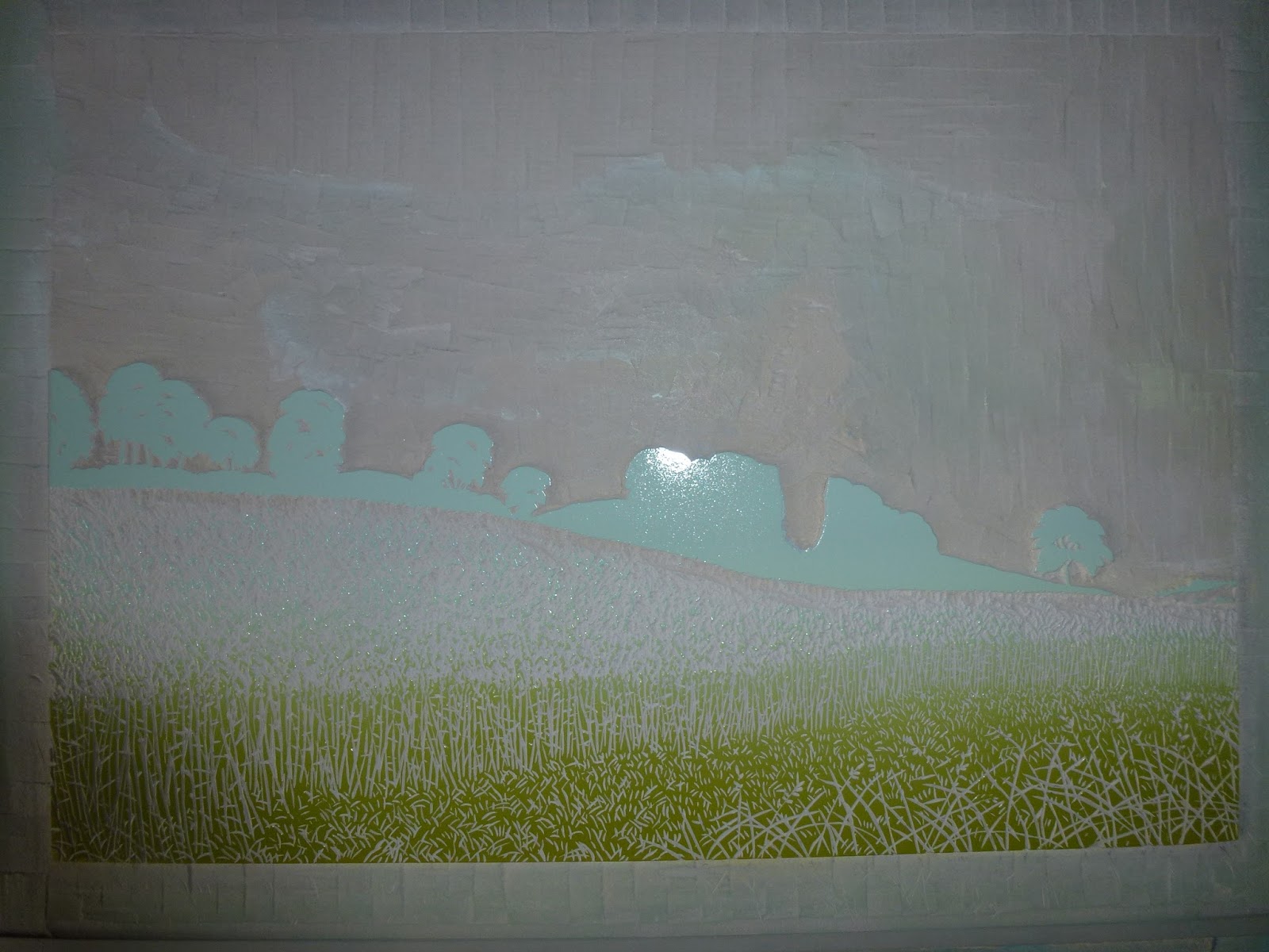
With the owl more or less finished apart from dropping in a final dark for its eye. It's time to turn back to the landscape. The 7th stage is another blend.


The ink rolled out gives an indication of how the block has been cut.


The difficulty now is to maintain the atmosphere of the print.


After more cutting Stage 8 is a two colour blend.


On the block a big area in the centre has been removed.


and printed. The next colour changes need to be quite subtle to maintain the dusky atmosphere.


Stage 9. Two colours, a darker blue grey and a dark brown for the wheatfield. The small blob of ink floating around on its own to the right of where the Owl was will drop the dark colour on to its eye.


Printed and we are nearing the end. Only a couple more stages to go.


Stage 10. Two more colours, another dark grey and a dark green.


Not much lino left now.


After printing only a final dark colour to go now.